THE CHALLENGE
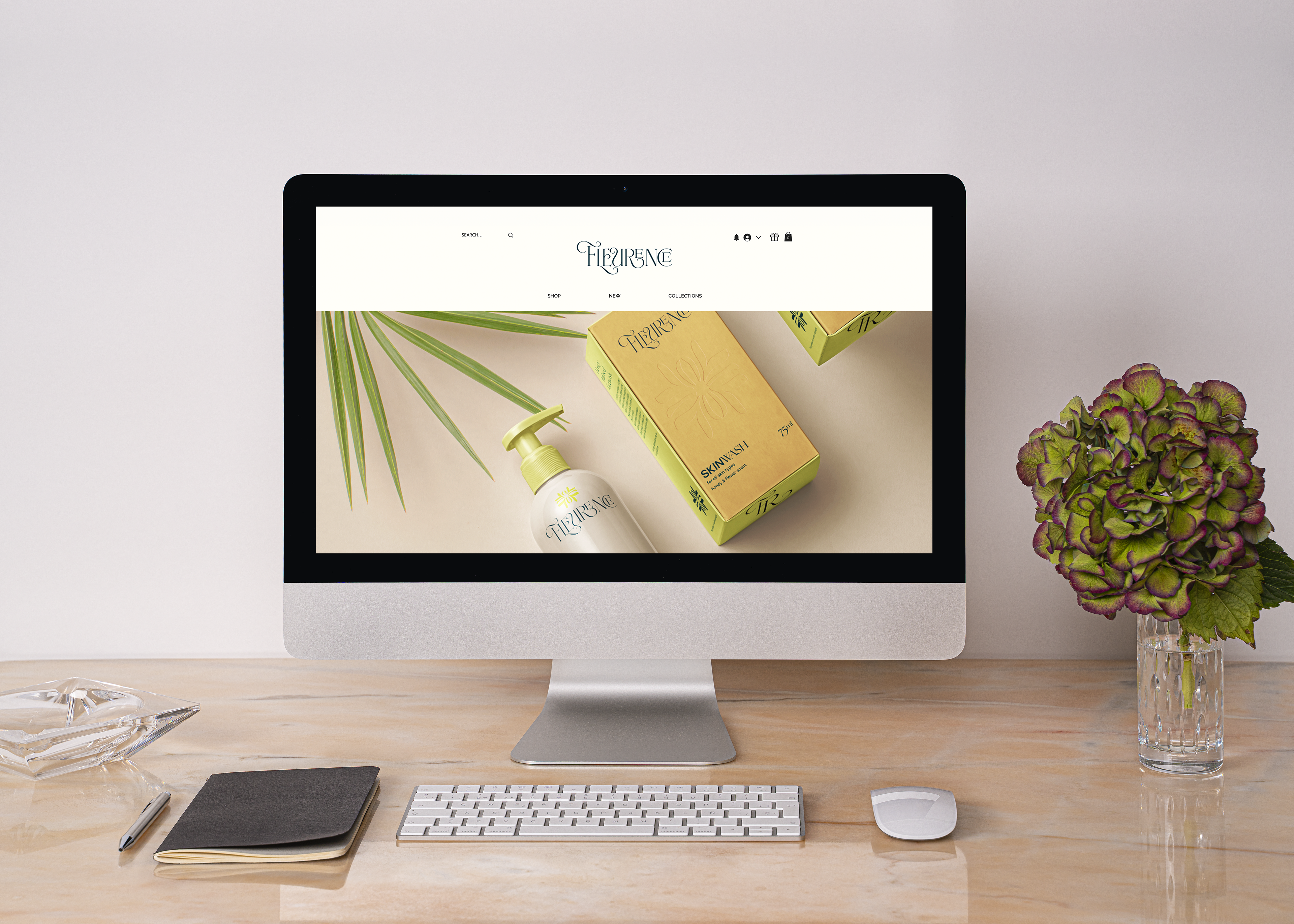
Fleurence, a skincare brand rooted in the purity of honey and flowers, needed a unified and captivating brand identity to stand out. In a market crowded with competitors boasting distinct visual styles, it was essential to craft a unique and competitive appeal for Fleurence.
THE SOLUTION
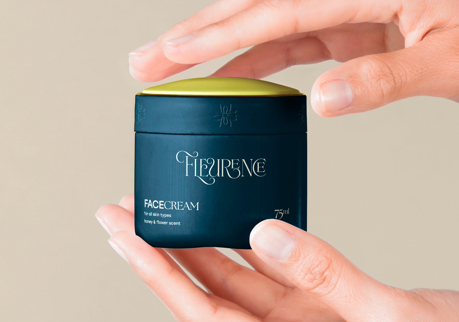
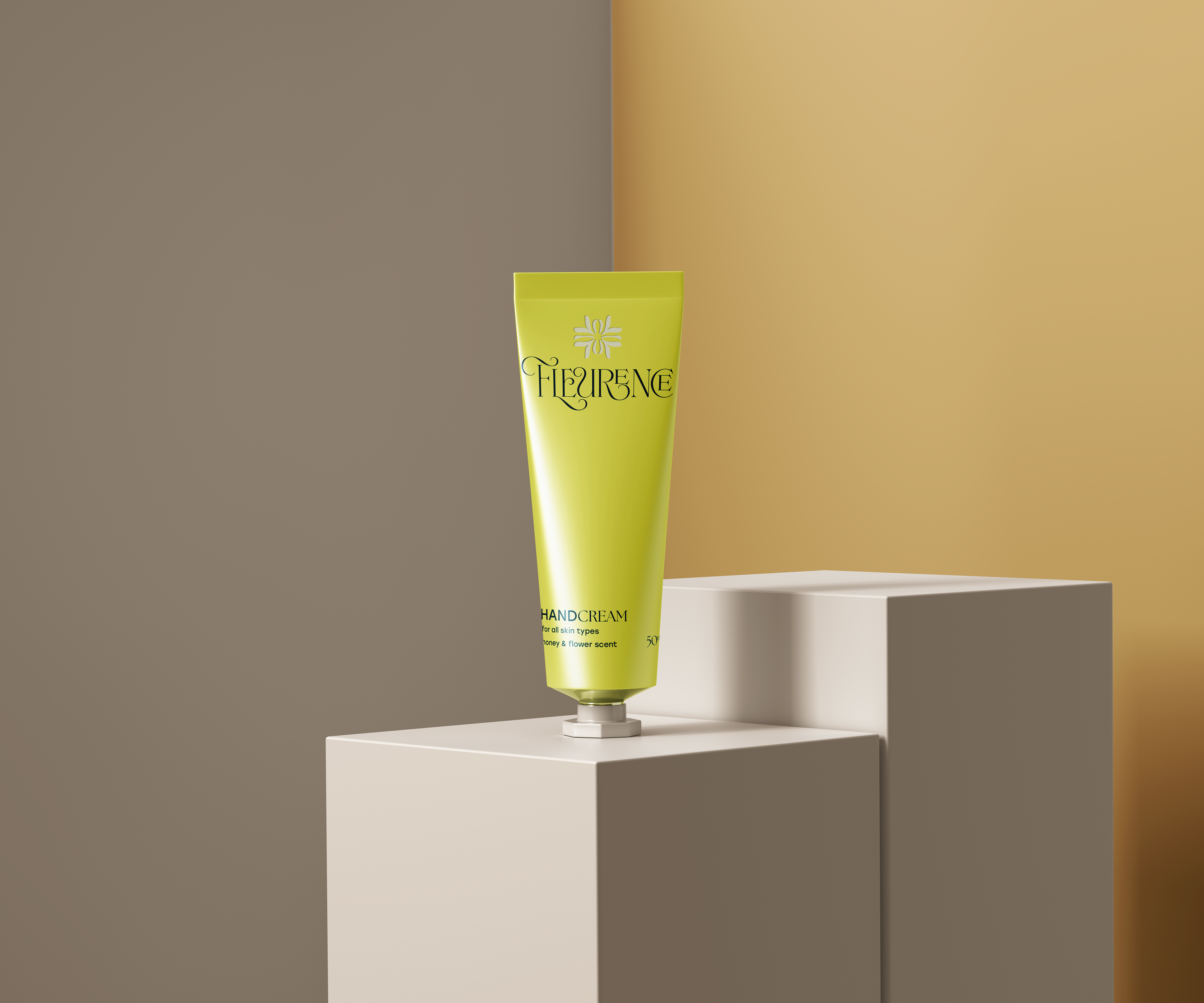
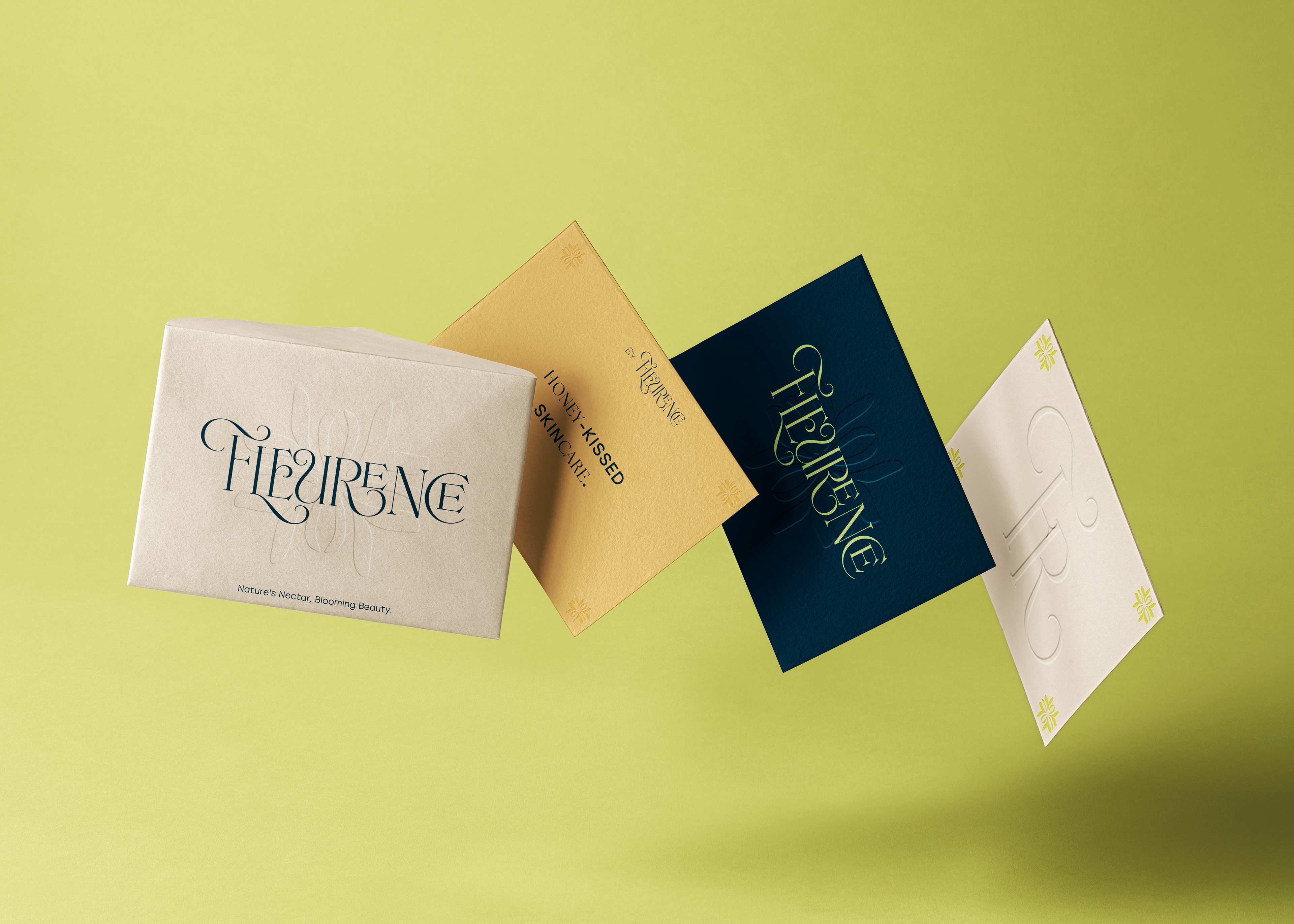
Creating a Distinctive Logo: The logo reflects elegance and well-being, designed to be memorable and align with the brand’s nature-inspired values.
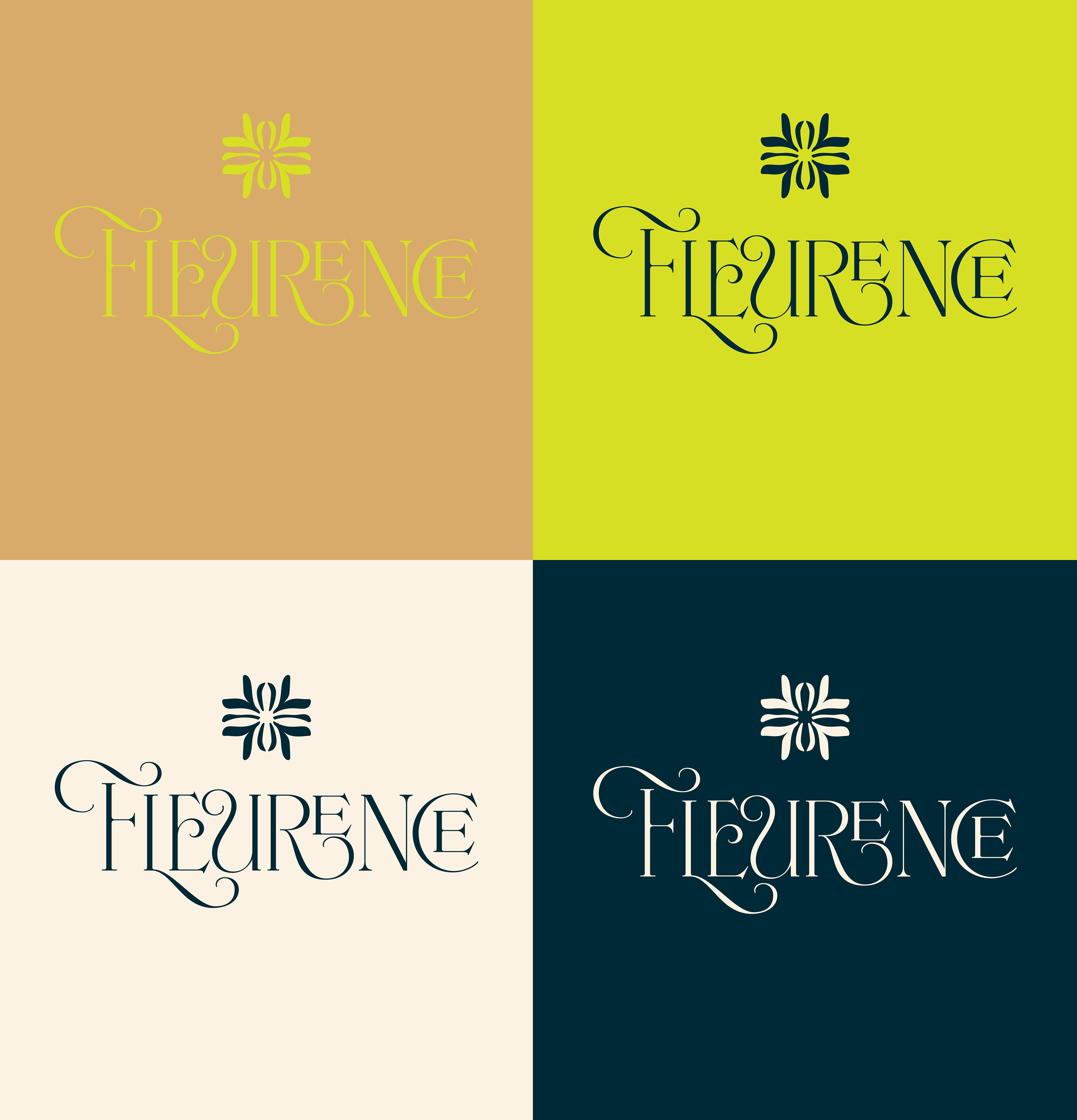
Choosing a Color Palette: The colours convey vitality and purity, reinforcing the brand’s identity as a luxurious, natural skincare provider.
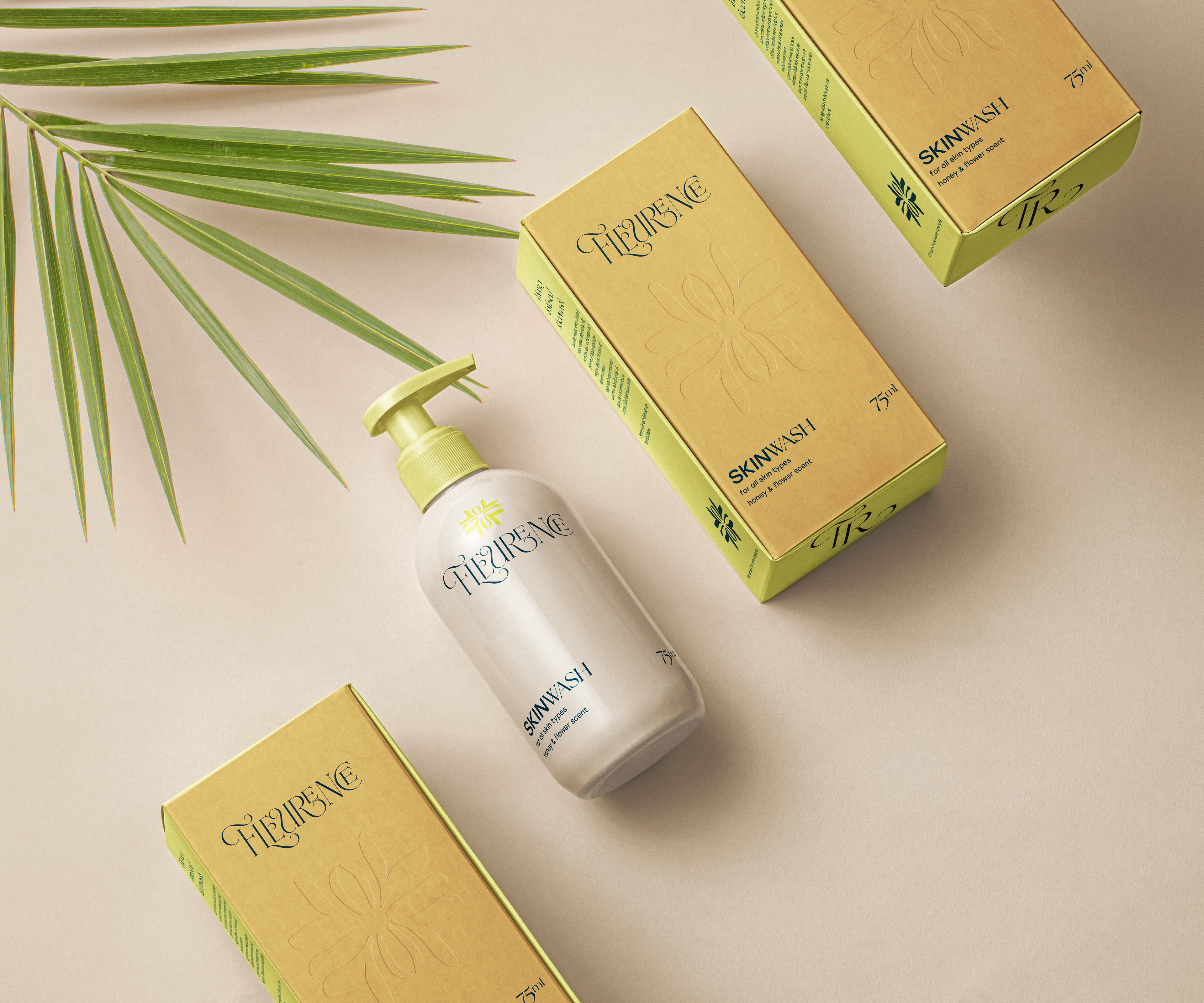
Designing Tailored Graphics: The graphics illustrate a complete skincare routine, guiding customers through both body and face care with a cohesive, holistic approach.
THE MOOD BEHIND THE DESIGN
This visual identity draws inspiration from vintage glossary sketches of insects and flowers, blending a nostalgic Belle Epoque vibe with a modern twist. The logotype’s font evokes a dreamy, historical charm, while the bold green adds a contemporary edge. The deep blue enhances a sense of luxury, perfect for the brand’s most premium products. The light brown subtly indicates the skincare focus while emphasising the natural ingredients, while the cream white conveys a sense of cleanliness and purity.
